Book Review: My Way to Typography by Wolfgang Weingart
When I attended graphic design school at North Carolina State University, one of the required classes was the history of graphic design, taught by professor Martha Scotford, author of Cipe Pineles, A Life of Design. As we discussed the turn from Modernism to Post-Modernism, the name Wolfgang Weingart came up. He was described as a rebel and a rule-breaker, flying in the face of classic Swiss modern design with its neutral outlook and grid systems.
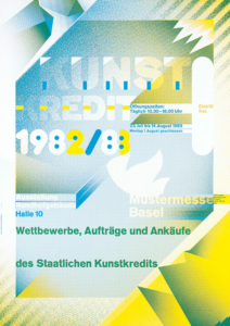
We saw a few images of his work; the ones I remember are his famous posters for KunstKredit and the Swiss Poster Exhibition (Das Schweizer Plakat), pretty much what everybody references when discussing Weingart. I wasn’t immediately drawn to those examples, so I didn’t investigate further.

Recently, I came across Weingart again when reading about post-modernism in graphic design. I found that books about his work seemed to be rare, although I found several older articles in magazines. I discovered he had written a monograph called My Way to Typography. Long out of print, I finally found a reasonably-priced (?) copy on eBay, although the original publisher Lars Muller has announced they will publish a paperback version sometime this year. Oh well. (6/29/23 update: Lars Muller now has the reprint of My Way to Typography in stock.)
Weingart had an interesting background, having trained as a classic letterpress typographer, not a graphic designer. That experience had a huge influence on how he approached design, yet at the same time didn’t limit him from experimentation and stretching legibility to the breaking point.
Basic exercises formed much of his approach, such as experiments collaging the letter “M” and circular compositions formed of lead type. His work with overlapping screens to create moire patterns presaged work done with the personal computer years later.
Looking back, what is curious is that we students didn’t really investigate his work in our studio assignments. I graduated from NC State in 1995, during the heyday of the “Cranbrook style” of semiotics and deconstruction. Several Cranbrook alumni taught at NC State, including Andrew Blauvelt. Looking at Weingart’s work in the 70’s and 80’s, I can trace a direct line to stylistic elements that define the work coming from Cranbrook. For example, here is his 1976 cover for a special section of Typografische Monatsblätter magazine:
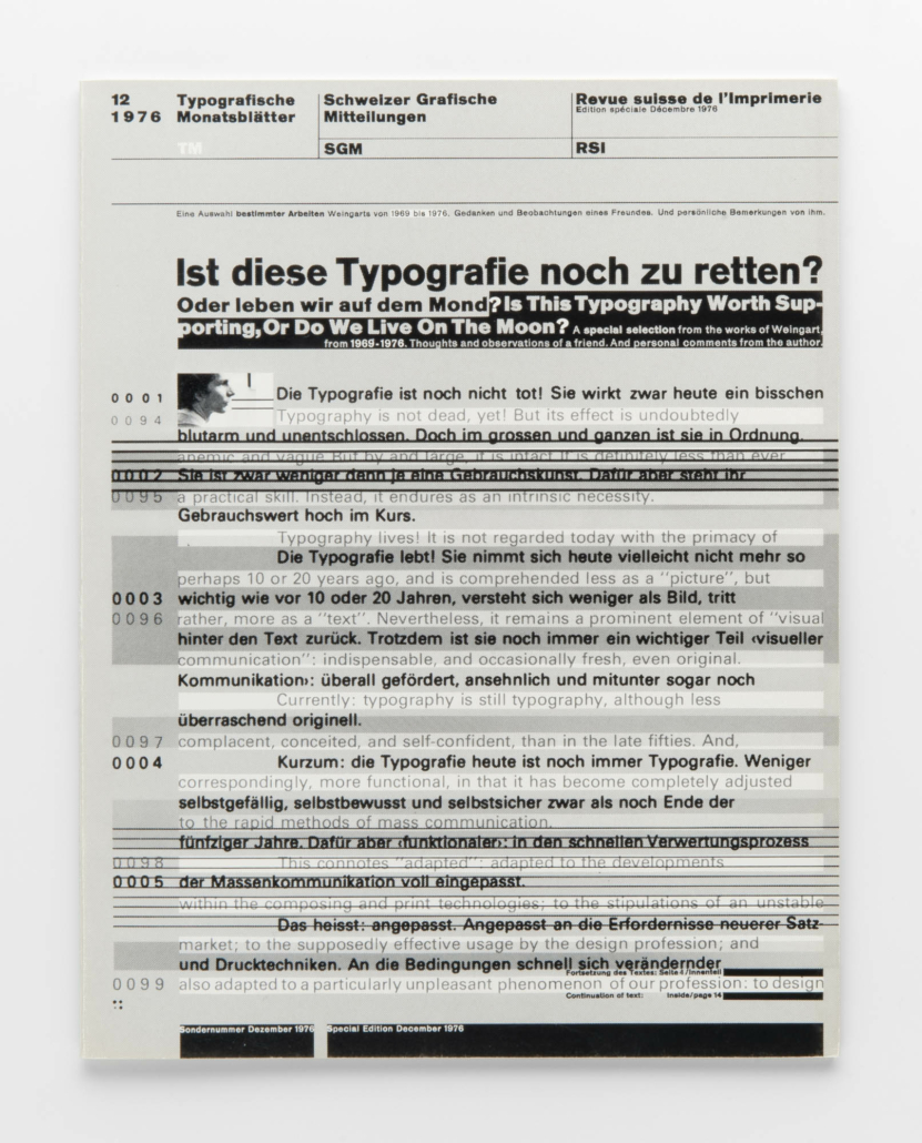
Cover of Typografische Monatsblatter supplement, 1976.
One can see heavy use of horizontal rules, irregular fields of reversed type on a dark background, and typesetting that makes demands of the reader, to the point where rules trespass through some lines of type. These elements made their way into the “Cranbrook aethetic” and the work of those who closely followed, such as David Carson.
Below are other examples from Weingart and Cranbrook:
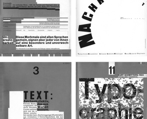
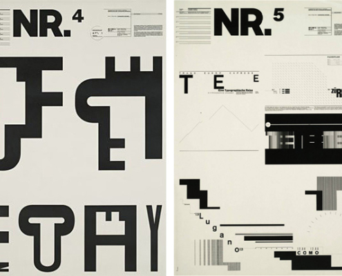
Handset type, part of a cover series for Typographische Monatsblatter, 1972-73.
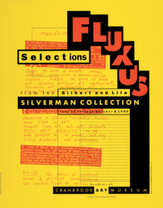
Poster by Katherine McCoy, Cranbrook Academy of Art, 1989.
Another example:
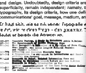
Photographic distortions of type, 1974.

Posters by David Wise, Cranbrook MFA class of 2015.
Additional evidence of Weingart’s influence on Cranbrook was his U.S. speaking tour of 1972, which included a stop at the school. He discussed his methodologies, including the use of semiotics as a way to signify concepts. A key tenant of the Cranbrook methodology was taking semiotics, the literary study of signs and symbols, and attempting to translate that to product and graphic design.
Having read the book, I still feel that there are gaps in explaining his journey from typesetter to the “bad boy of Swiss design”. I chalk this up to an artist’s evolution – some things just can’t be fully explained.
Note: No Generative AI was harmed (or used) in the writing of this article.
Photo of letterpress type by Bruno Martins on Unsplash


