Book Reviews: Flexible Visual Systems & Designing Programmes
What’s the first thing you think of when you hear the term “brand identity”? For a lot of folks, it’s the company logo. There are some logos that instantly come to mind when the company name is stated: IBM, Apple, Starbucks.
So if logos can be so successful, why stray away from the practice of designing a logo for every business? One reason is that for every iconic logo there are tens of thousands that don’t add anything to the product or service they are representing.
“Instead of solutions for problems,
programs for solutions.” – Karl Gerstner
Why is that? Successful logo design is a very exacting blend of art and science. Countless books have been written about the process, cataloging thousands of logo designs from around the world. In my experience, really good logo designers don’t grow on trees, so you get a lot of stuff that looks alike.
Another reason to reconsider logos is the many ways we now communicate, with screen interfaces and virtual environments, where motion is taking center stage and the demarcation between text and image has been blurred. These environments call for more flexibility than was required when we were paper-based.
The two books I read recently, Flexible Visual Systems and Designing Programmes, take a different approach and argue that you don’t need a logo, you can develop a system that encompasses any use case, any medium, or any combination of text and graphics.
I’ve always liked the concept of frameworks or systems to organize information and provide context, so I was drawn to read Flexible Visual Systems just by the title. Flexible Visual Systems (FVS) is a framework developed by Martin Lorenz that builds off of basic shapes and processes.
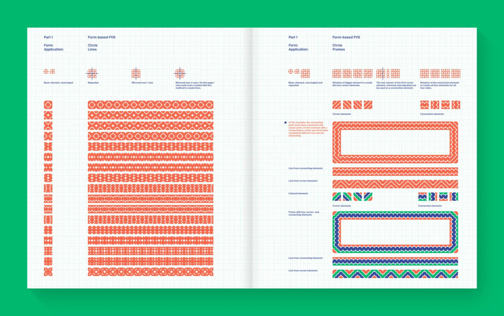
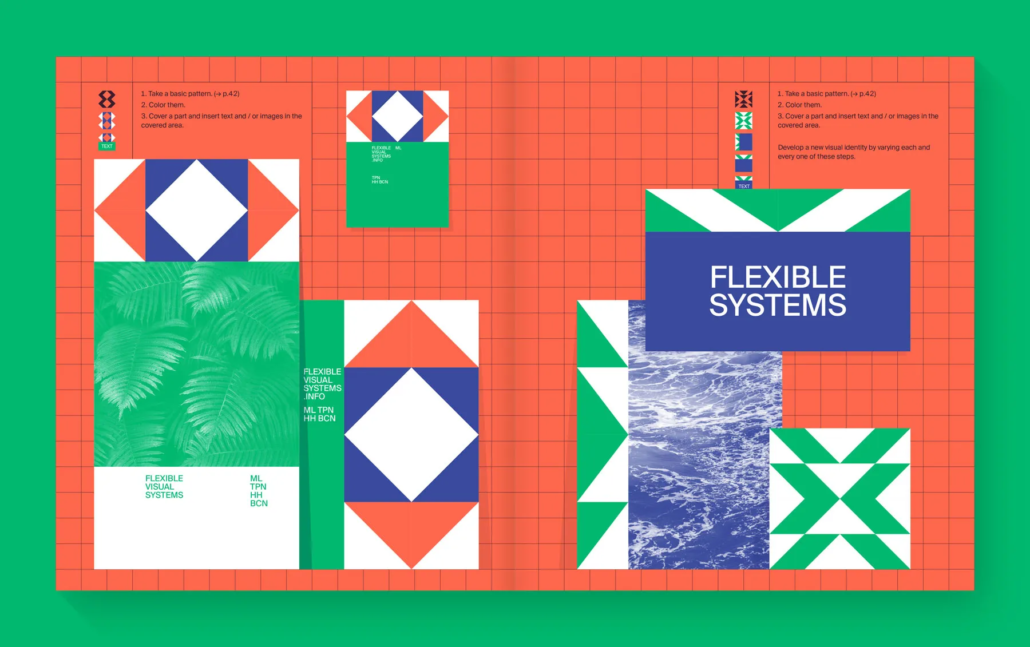
Most of his book is dedicated to Form-based FVS, which uses simple geometric shapes such as a triangle, which are then added together, repeated, or mirrored over one or two axes. Exploring the permutations leads to constructions of greater complexity, which are then extracted, colored, and used as visual assets on their own or as accompaniment for text or images.

One hundred and twenty-eight pages of the book are dedicated to explorations of basic shapes, perhaps more exhaustive than it had to be. Once you understand the process Lorenz is going through, you can think of this section as a reference guide.
The drawback of Lorenz’s approach is that his manipulation of basic shapes often results in symmetric forms that lack the dynamism of asymmetry. He organizes them into frames and complex lines, but how many design projects warrant that look? However, his examples of how he applies his forms to print-based layouts do show promise. Lorenz doesn’t devote any pages to screen interface design or animation.

Of more interest to me were the much shorter sections on Object-based FVS, based on three dimensional objects, and Interaction-based FVS, based on the juxtaposition of two shapes, such as a circle and a triangle. These ways of creating a system seem to have as much promise as basic forms, but the author only spends sixteen pages showing examples. Much less explanation, but the results are more interesting.
The final FVS Lorenz discusses is the Transformation-based system, in which shapes, type and images are manipulated by actions such as skewing, rotating, and mirroring. The examples Lorenz uses in this section are hit or miss, with some of the type and image transformations of little visual interest.
Lorenz acknowledges Karl Gerstner as a major influence on his work, which brings us to Designing Programmes, first published in 1964. Gerstner uses examples from art and architecture to show how programs, or systems, have been used through time. Lorenz uses Gerstner’s section on Programme as Method as the jumping-off point for his work, but Gerstner also discusses using systems for developing a typeface, arranging typography, and developing imagery.
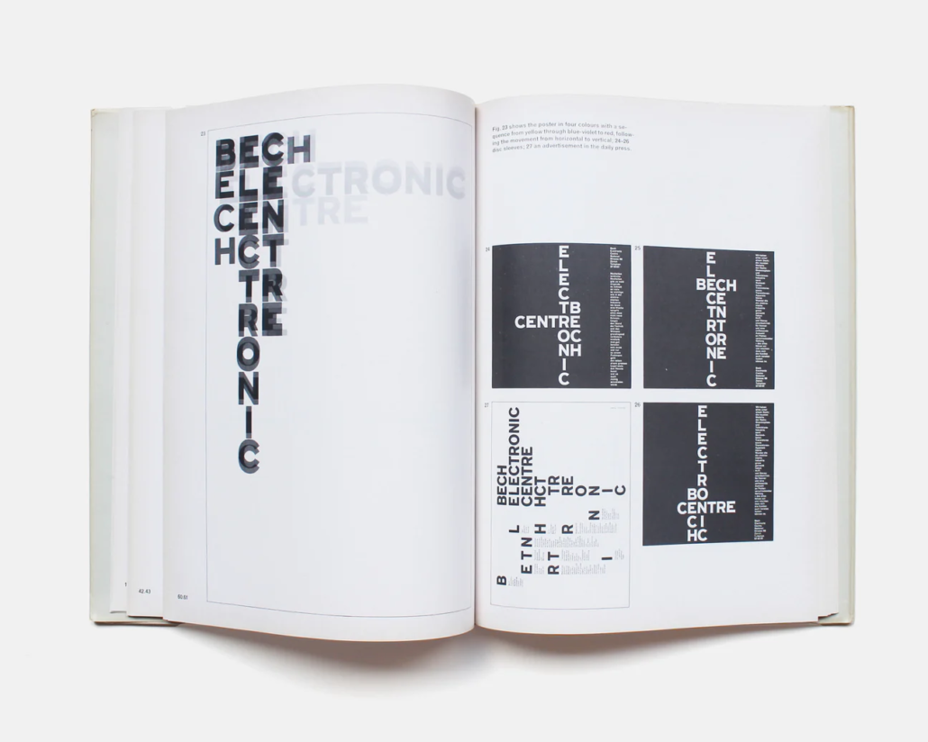
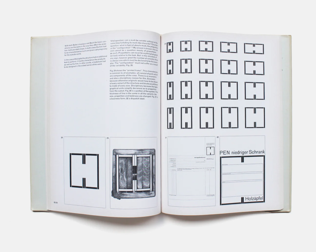
One of the most valuable aspects of this book are the examples Gerstner designed for various companies. These show the potential for how a system can be applied using shapes in a different way than Lorenz, or by just using typography. The examples below are two of Gerstner’s most famous designs, the identities of Bech Electronics Center and Holzaphel, a line of furniture with their own retail stores.
Gerstner capitalized on “Bech” having three letters of the full company name to make a palette of sorts of the different letters. These are then composed in different combinations and typographic shapes depending on the communication piece. The result is a playful, ever-changing identity that goes beyond a logotype, in which the form is usually fixed.


Gerstner’s design for Hozaphel probably comes closest to a logo, although in this case the “H” form is not only a brand signifier but also a grid, an organizing structure for the type and image contained in each piece. The shape itself is a clever allusion to both a structure and a physical environment.
Together, these books make a convincing case for considering a system for brand identity, rather than reaching for that logo book for inspiration.
Note: No Generative AI was harmed (or used) in the writing of this article.


